The first harbinger of a new year is the December release of Pantone’s “Color of the Year.” The Pantone Color System, originally developed for the print industry, has come to influence most other areas of design – fashion, interior design, product branding, graphic design and more. The pick for 2019? “Living Coral.”
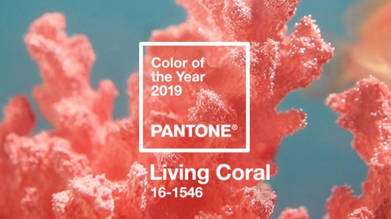
“Just as coral reefs are a source of sustenance and shelter, we see this color giving us assurance and buoyancy in an environment that’s been continuously shifting for 10 years,” said Laurie Pressman, vice president of the Pantone Color Institute, when the choice was announced. “We’re looking toward those colors that bring nourishment and the comfort and familiarity that make us feel good.”
We live in a world of color. Color sets mood, creates cohesion between objects, and enriches our lives. We are affected by color in countless ways. We experience daily color changes in nature, and we are constantly bombarded with carefully selected colors in everyday society: fashion, buildings, transportation, branding, and more. While the human eye has the capacity to see millions of colors, it may seem hard to imagine that a small set of colors can end up defining a decade. This demonstrates just how important the role color has become.
Color trends are influenced by our experiences in many ways, from seasonal changes in nature to cultural and societal events. This chart is an illustrative breakdown of the top trending colors from the last century. When you think about the overarching themes and historical events in the U.S. during each decade, it’s evident how color preferences are influenced by societal, economic and global affairs. This excerpted graphic from Benjamin Moore proves the point:
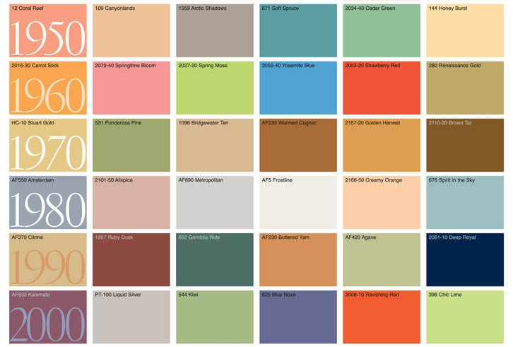
(Graphic: Courtesy of Benjamin Moore)
- 1960s – Promise, Progress: electric colors, mod madness
- 1970s – Vietnam War, Equality, Color TV: bright earthy tones (avocado, burnt orange)
- 1980s – Excess, Opulence: pastels—think Miami Vice–and neon/bright computer graphics—think Apple and Atari.
- 1990s – End of the Century: more somber/muddy tones, jewel tones Post-Modernism winds down (70s-90s)
- 2000s – Start of the Century, Prosperity, Tech boom: bold, bright colors
Juicebox Interactive’s blog post “From Harvest Gold to Millennial Pink: Colors That Defined the Decades” dares to predict the 2010 decade will be defined as “Exuberant Minimalism.”
As designers, we look to barometers from Pantone, paint companies, and industry shows like Neocon, for clues not only about current fads but those that might become classics over time. We help our clients negotiate this colorful landscape to make decisions that fit well with their culture and brands. The movement to use responsibly grown/harvested products in natural organic hues (white/gray/neutrals, wood, stone, metal) remains ever present in interior design and architecture. We see accents in pastels, colorful and dreamy gradients of a rainbow, alongside lively and bold, earthy colors (emerald green, leafy green, and actual live plants). All of these symbolize optimism and honest connection.
In a world where it’s easy to let technology, social media and other external events take over our lives, color can help us feel centered and balanced, carrying over to our relationships with each other and those with our natural environment.
(Sources: Benjamin Moore, Juicebox Interactive, Pantone)