Pladis North American Headquarters – White Plains, New York
Office design is ever-evolving. So is the way we think about architectural graphics. Incorporating graphics into a space is nothing new, but many of the reasons we choose to include graphics have changed. Historically, graphics have been used as wayfinding tools, distraction markers, and brand representation. Today, there is an emerging trend to use graphics to distinguish a company’s culture.
Modern-day office plans typically offer people innovative and flexible working spaces. These flexible spaces include zones to focus, socialize and entertain. The desired mood of these various zones is often discussed in the early stages of design, and graphics are a powerful design component to achieve the desired outcome.
Graphics can create emotional reactions – motivation, inspiration and admiration. Imagery of founding owners and historical photos can establish a timeline about the company’s evolution to present day.
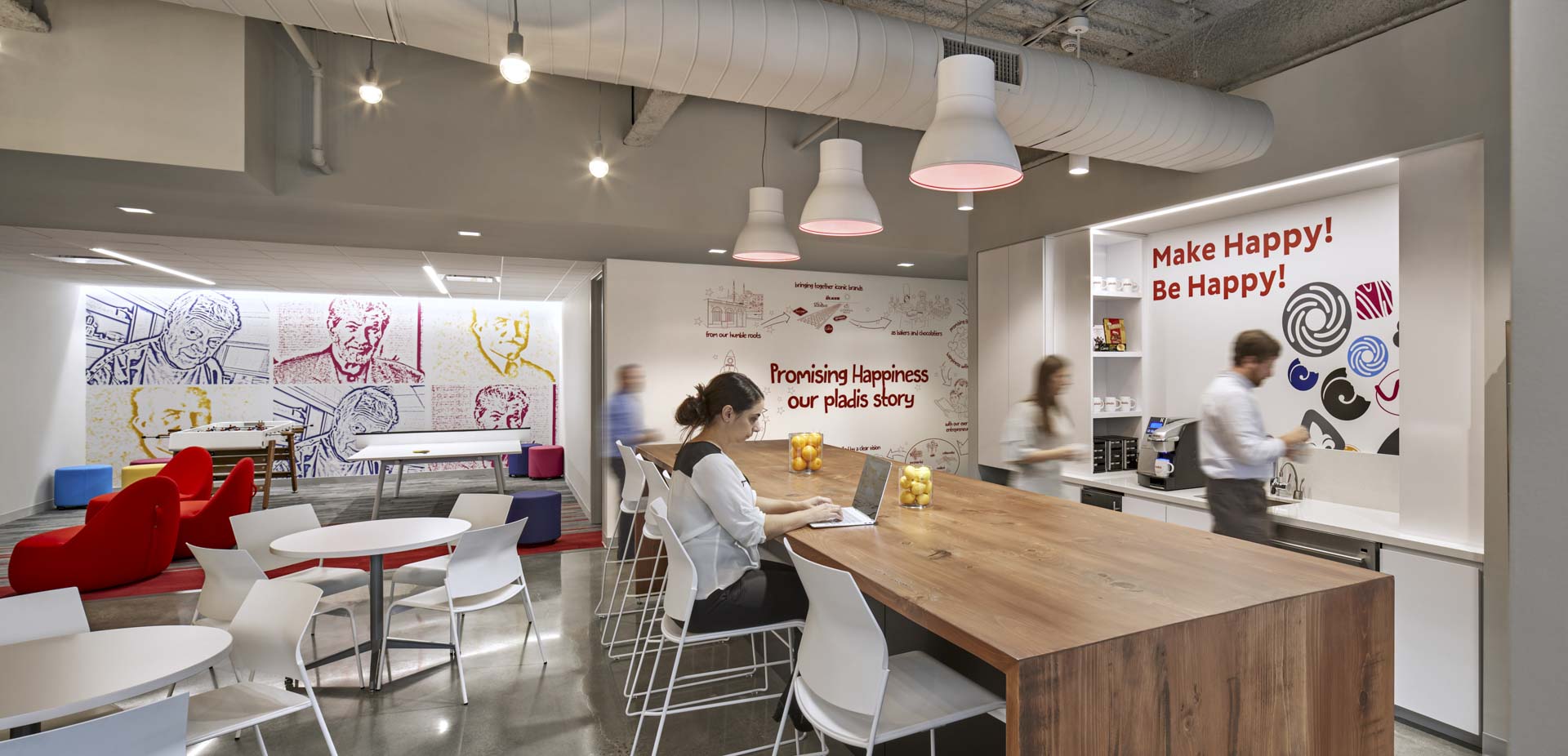
Pantry and Game Room at Pladis
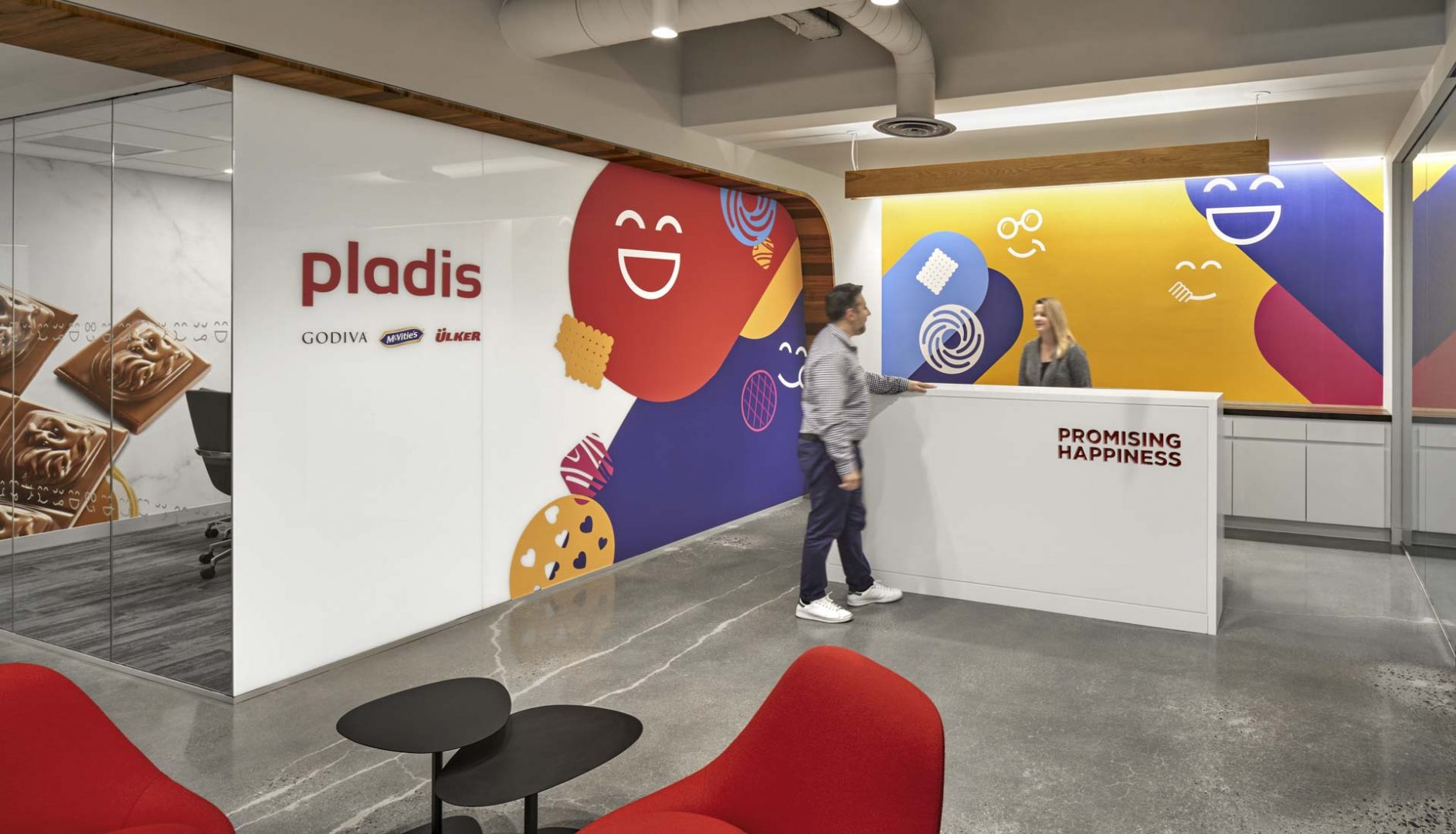
A project I recently had the pleasure to work on is the North American headquarters for Pladis, a European-based confectionary company. Pladis combined staff from multiple offices into one location in White Plains, NY. The graphics package included an array of colorful and playful imagery associated with the company’s Website and other international office locations. Much thought went into the why and where of these graphics, and groupings were organized in a purposeful manner. Visitors are greeted by the company’s “present-day” brand motifs. More personal employee spaces, such as the Pantry and Game Room, are distinguished with graphics honoring Pladis’ history. The open office work space depicts the company’s envisioned “future,” complete with core and motivational phrases. We worked closely with Pladis leaders and marketing staff to select and obtain graphics best representing the company’s individual brands to display in Huddle Rooms, where teams gather to work and brainstorm on Godiva, Flipz Pretzels and Carr crackers products.
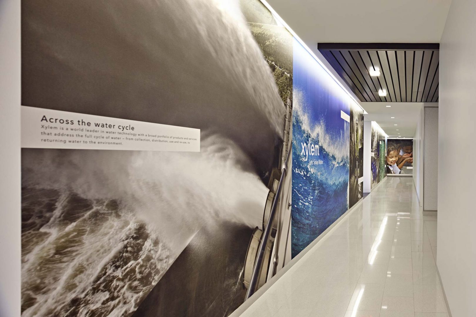
Wall graphics featuring the planet’s water cycle line the executive office corridor at Xylem – Rye Brook, New York
Graphics also can play a powerful role to describe a company’s contribution to the world. An example is an earlier Amenta Emma design for Xylem in Rye Brook, N.Y. Xylem develops drinking and wastewater systems to improve water quality and accessibility in more than 150 countries. Xylem wanted its new corporate headquarters to express its values through design. Near the entry, and in several key office locations, are wall murals describing our planet’s water cycle. An interactive map illustrates project locations around the world. Visitors ascend an open staircase that rises along a two-story wall etched with an image of microscopic plant tissues that conduct water from soil to plant. Success stories line the path to the CEO’s office; the last image shows the company’s work to help save African children through water solutions. The execution is a wonderful convergence of interior design and corporate mission.
The hope for any well-conceived office design is to make a lasting impression through the creation of memorable moments for both employees and visitors. Architectural graphics are an effective solution.


