Why is it always so hard to commit to a color? It’s not just that it’s hard to narrow down the paint chips. Even in nature, color is always changing. The sky, for example, goes from the pinks and reds of a sunrise, to bright blue during the day, deepening to rich deep blues and blacks at night. The leaves of a tree glow in the light, but also change throughout the year identifying each season, from bright green in spring to a vibrant palette of reds, yellows and browns in the fall. Committing to color is like trying to freeze time. It feels unnatural.
How can we overcome this fear of commitment? You can think about what feels right, what belongs together. In color theory, one might consider an analogous scheme, a complementary scheme or a triad scheme.
- An analogous scheme includes colors next to each other on the color wheel, sharing a common tone. For example: red, orange, red-orange. In this kind of scheme, one color is dominant, one supports, and the third accents. They are harmonious.
- A complementary scheme involves colors opposite from each other on the color wheel. For example: blue, orange. These are especially successful when you want something to stand out.
- A triad scheme includes colors that are evenly spaced around the color wheel, for example: red, yellow, blue. These are vibrant and need to be balanced carefully.
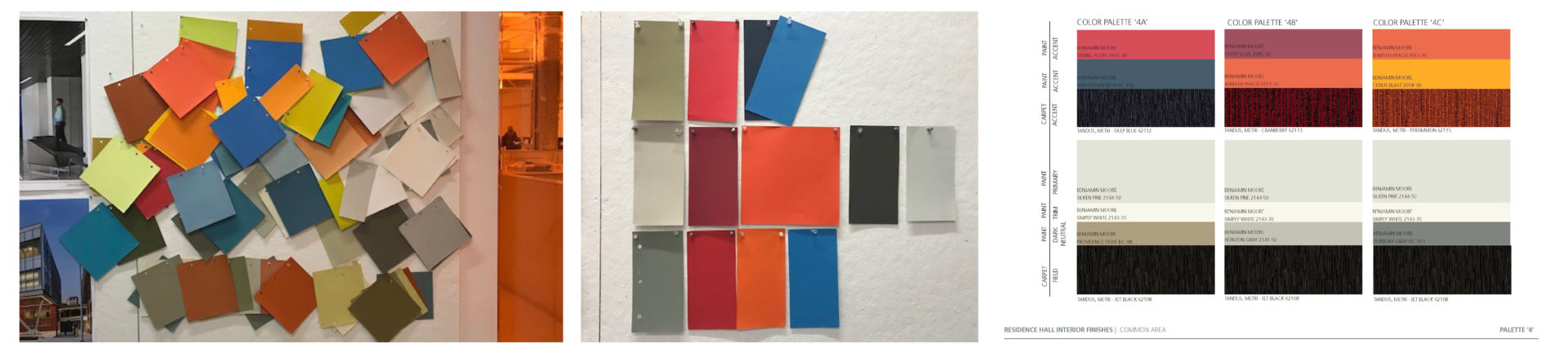
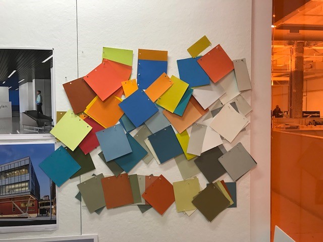
Color study for Springfield College.
At Amenta Emma, we use all of these schemes, as well as some others, in our work. At Springfield College, we were asked to select color combinations for education spaces, administrative spaces and residential spaces. The challenge: everything had to work with burgundy, the school color. We must have looked at 200 color samples. We did a study, pinning up various colors and color combinations over the course of a few days. The result was three different palettes. In the education spaces, the teaching walls were a bright accent color, because research suggests this helps keep students focused. These were supported by a neutral color palette on other walls. For the administrative and faculty offices, we selected a different neutral palette, grey-blue, so offices could be personalized. Residential spaces really popped. They couldn’t be too masculine or too feminine, but they needed to be lively. We used fuschia with navy and watermelon colors. All three color pallets were developed and studied to work with the color burgundy, which may or may not exist in the space.
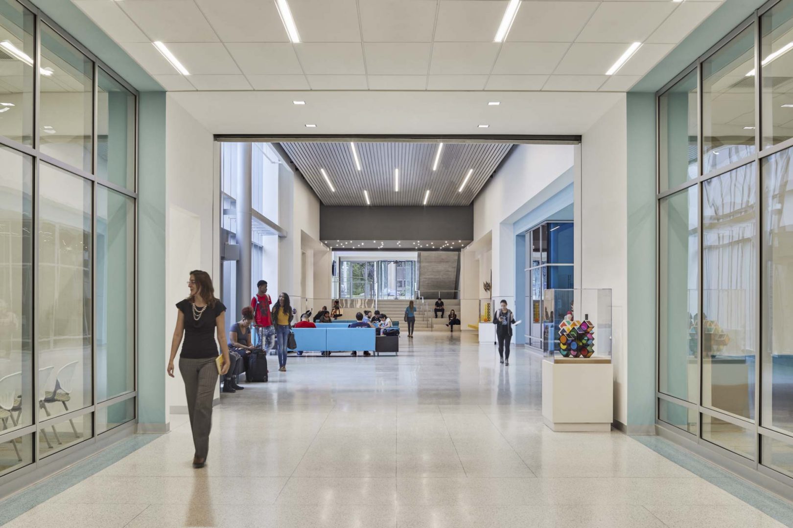
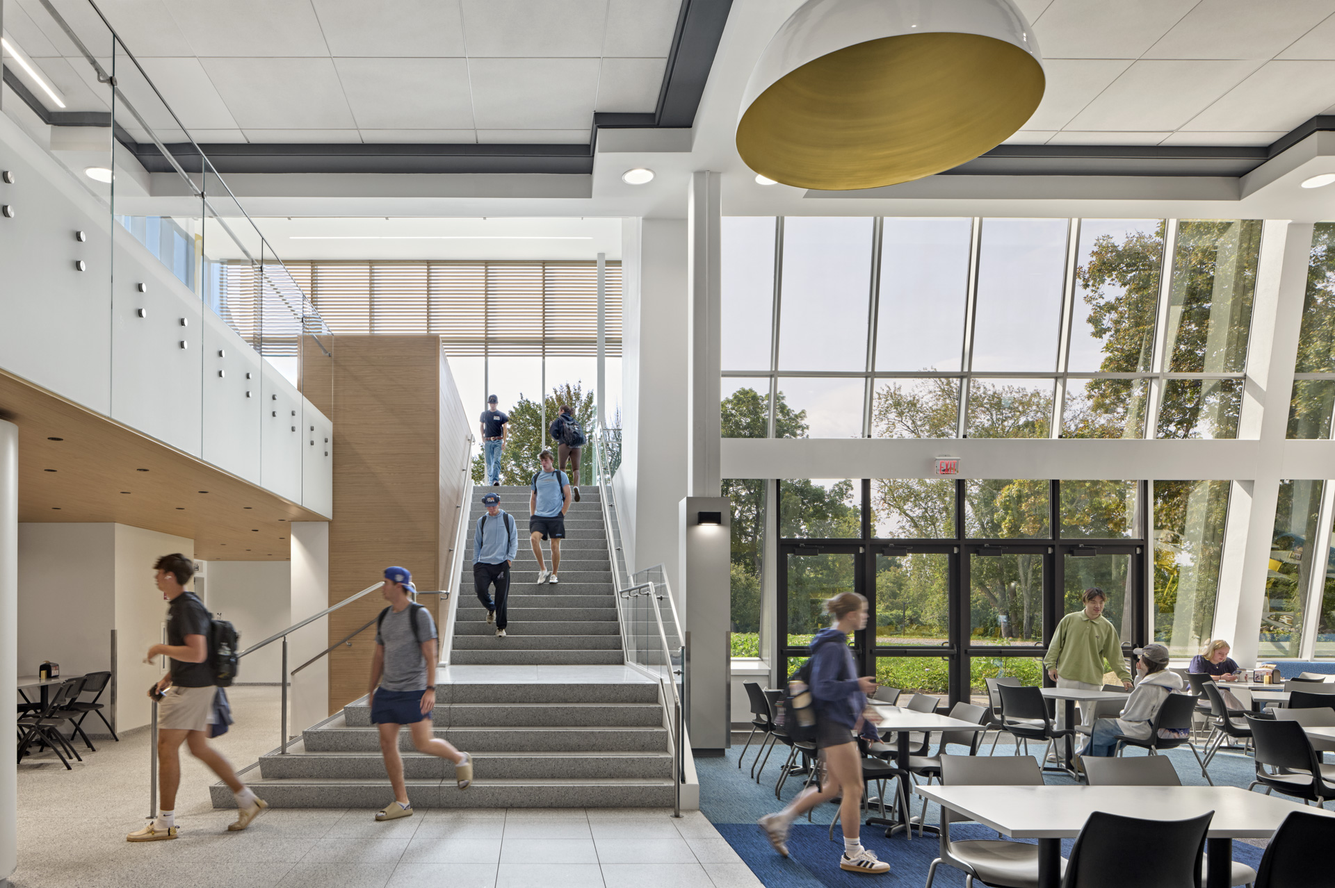
For the Welcome Center at Housatonic Community College, we kept many walls white, because we knew art from the school’s collection was to be displayed. But because there are art teaching spaces within the building, we also wanted there to be a conversation about color. We took hints from a terrazzo floor in the renovated portion of the facility and painted the stairwells chartreuse. We hoped it would ignite debate: I like it, I don’t like it, why?
A smart way to use a vibrant hue is to use it intentionally. For example, a lime green door, or pops of orange against an overall neutral palette of whites and grays, as in our own office environment, or as with Housatonic an over-saturated space of chartreuse creates an experience and ignites conversation. In this way, it becomes timeless. You have committed!
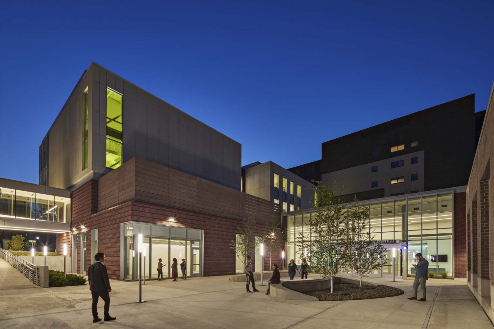
The chartreuse interior stairwell creates a pop of color against the neutral palette of the rear courtyard of Lafayette Hall at Housatonic Community College.