Jane Jacobs articulates the properties of older “chaotic” city forms, such as permeability, mixed uses, and density, in her seminal work, “The Death and Life of Great American Cities.” These qualities, when present together, contribute to a healthy and safe urban environment that encourages community. In another influential work, Kevin Lynch’s “The Image of the City,” Networks, Paths, Edges, Districts, Nodes, and Landmarks are identified as important components in the perception and mapping of cities by their inhabitants. Both of these authors illustrate the importance of the not-so-quantifiable qualities that converge to create cities that are organically interconnected and very livable.
At a smaller scale, these same principles can be applied to office environments. Corporate America is beginning to adopt a more ecological approach to their organizations, understanding that it is attention to such details that differentiates an office where employees sense ownership, stimulation and belonging vs. a dead office with an unengaged workforce.
Amenta Emma has a history of applying the principles of new urbanism to both communities and corporations. The following examples show how it works for the office environment.

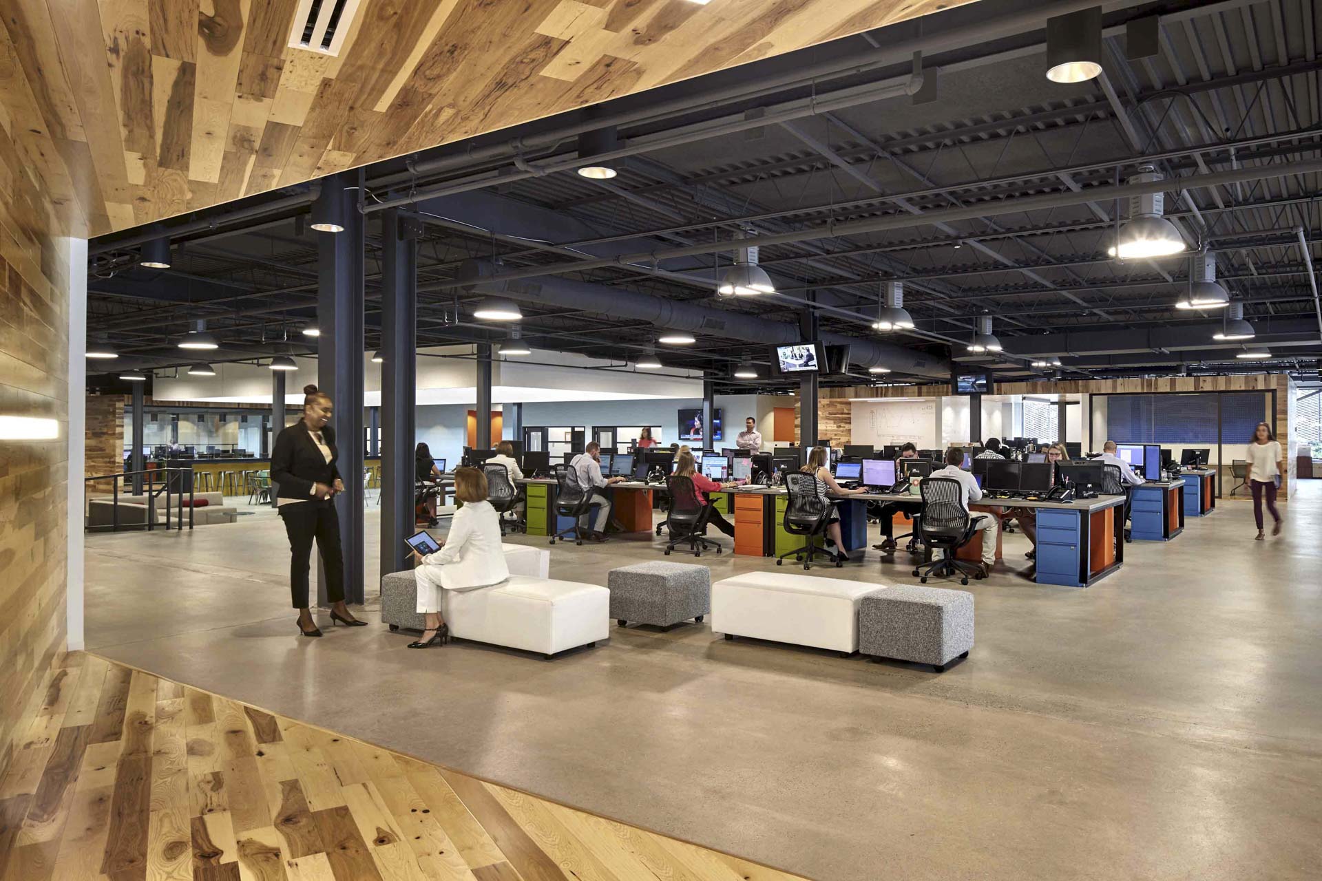
Symmetry Partners – Glastonbury, Connecticut
The District When it comes to creating a sense of neighborhood in an office, different areas can be given independent identities, with pathways that serve as connections between them. Pathways are opportunities to encourage spontaneous meetings, which promote communication, and a sense of community. Amenta Emma pioneered this idea when hired to develop new national standards and office prototypes for the insurance giant, Aetna. These ideas subsequently have been implemented throughout the organization in offices across the United States. A key design element was the organization of teams into “neighborhoods” of 10-26 people and one supervisor, connected with a circulation pattern of “city streets.” The plan solved employee alienation by integrating telecommuters into key teams and providing lots of collaborative areas. A more recent example of this principle is seen above at Symmetry Partners, a financial services company in Glastonbury, CT, where an open plan layout is interspersed with group seating areas and boxes housing private work spaces. These elements delineate the “districts” of work areas, while giving them unique components that encourage users to cross over and co-mingle beyond their familiar “home neighborhood.”
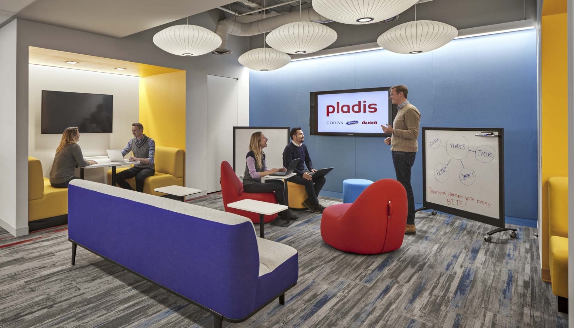
Pladis North American Headquarters – White Plains, New York
The Commons Does the office have clearly designated common areas for social interactions? Is there an array of such common spaces to choose from? Increasingly offices are moving towards a hierarchy of common spaces. These are distinguished from each other by their size, exposure, and the types of interaction levels they encourage. For example, smaller gathering areas strategically dispersed throughout an otherwise uniform field of desks provide destinations for casual interactions between users. Such lesser common spaces reduce loads on the main common spaces, such as dining rooms, and encourage traffic to otherwise isolated office areas. A great example of this thought process is seen in the office for the biscuit and confectionery leader Pladis, where such a hierarchy of common spaces provides a rich environment for work and socializing.
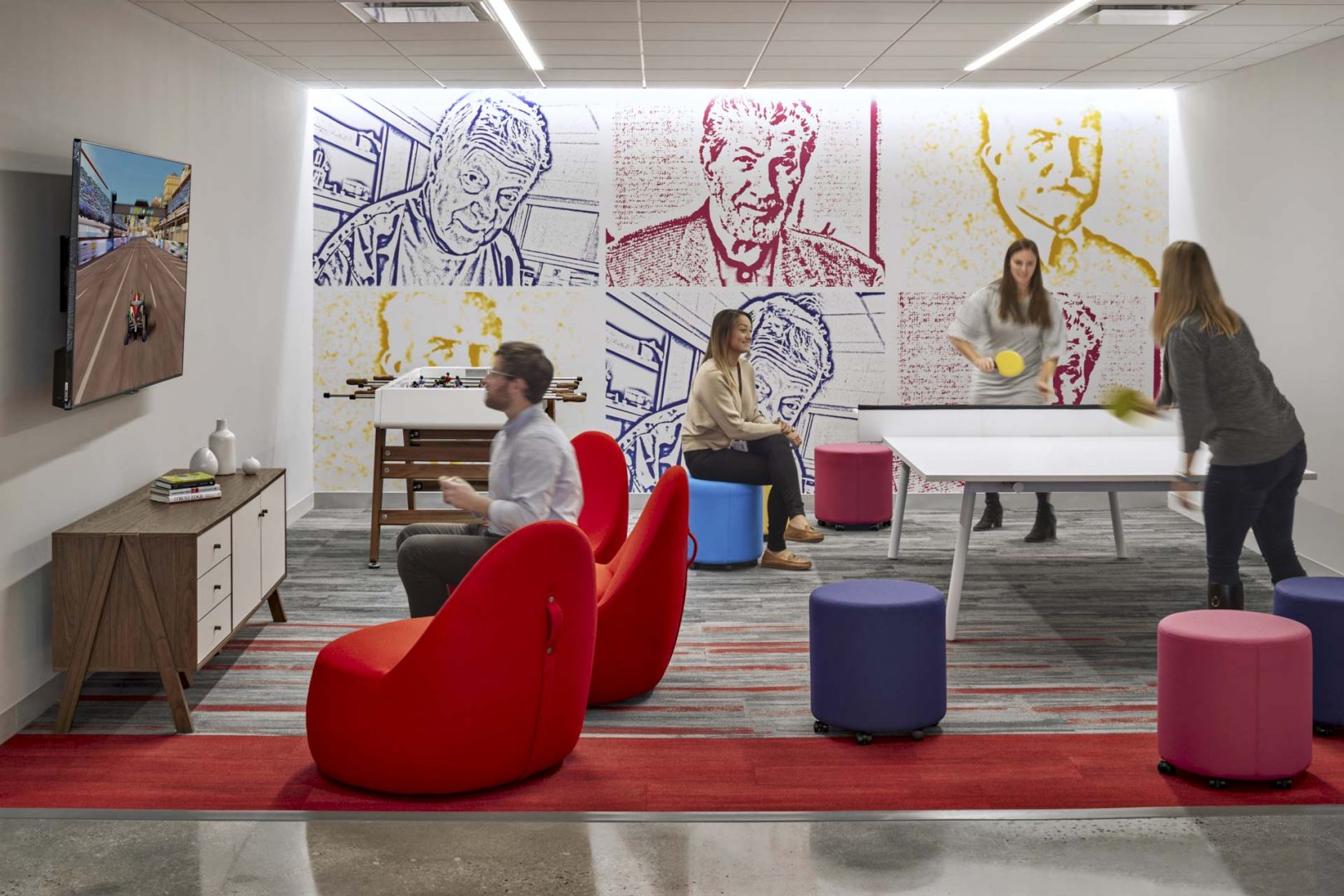
The Game Room at Pladis
The Nodal Point This is a point of intersection that members must use for vital resources. In our own Hartford office, nodal points have formed spontaneously. One example is the finish library, where encounters with colleagues from different departments frequently lead to important informational exchanges. The nodal point can be a front desk or a project manager’s workspace. It is important to consider special needs and to provide the flexibility to allow such spaces to function properly. At Prolific Interactive, a mobile app developer in Brooklyn, NY, the library element was integrated into the Collaboration Core which adjoins conference rooms and huddle rooms. The entire core is surrounded by café and lounge seating, allowing accidental collisions to easily flow out and turn into sit-down conversations where ideas can be exchanged.
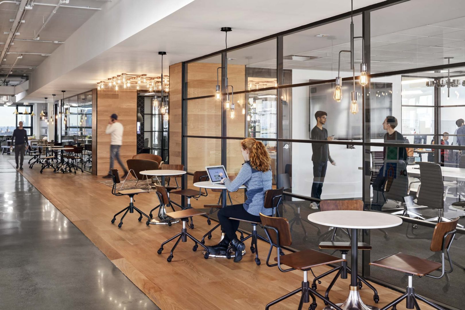
Prolific Interactive – Brooklyn, New York
The Sanctuary In the urban design analogy, the retreat can be compared to a park where one goes to relax or work in solitude and peace. These spaces can be social in nature or can be strictly individually oriented to cater to solitary work or relaxation. More and more we are seeing clients asking for dedicated quiet rooms or meditation spaces, especially as offices embrace the open plan layout and the remote working model. At Remedy Partners, a young, innovative healthcare technology company, with offices in Norwalk and Darien, CT, and New York City, the idea of the library as a sanctuary, especially for millennials coming out of college, was used for the communal quiet area. Like a library, it also features multiple “nooks” surrounding a main open space for heads-down work, and a no phone calls policy is implemented.
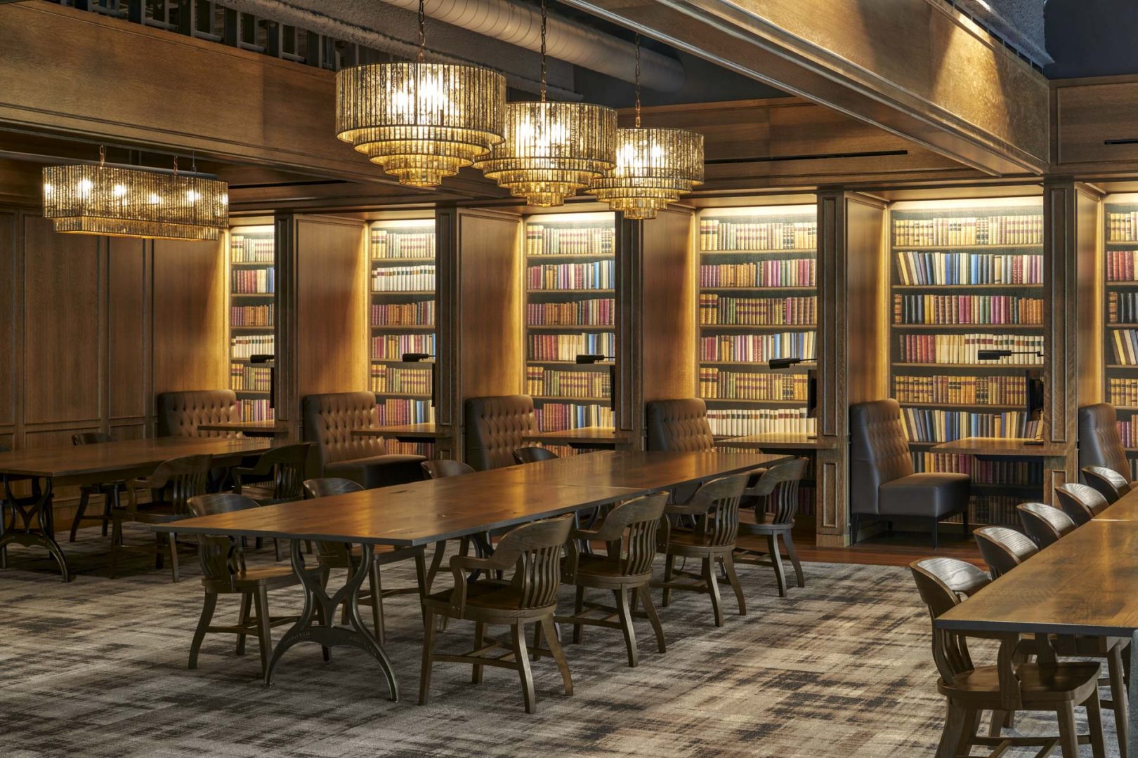
The “Communal Library” at Remedy Partners – Norwalk, Connecticut
The Future A move away from single-use segregated offices to an overlapping ecology of spaces reflects new urbanism principles at work. While it is more difficult to accomplish, the rewards, just as with well-planned cities, offer employees a healthier and richer environment. It’s good for business.

