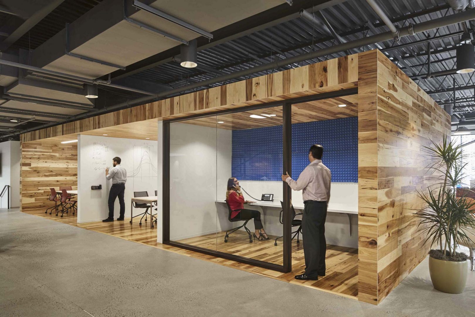
Symmetry Partners – Glastonbury, Connecticut
As the open office concept evolves and adapts, thoughtful design solutions can contribute to a cohesive, well-organized space. As discussed by my colleague Nayef Mudawar in our March 7 blog, Office Duel: Open vs. Private, one of the many challenges we encounter is the constant conflict between open and private space. In our continuing search to find the right balance, The Box, has become an integral part of our design vocabulary and aesthetic. The Box is born out of both functional and aesthetic demands, making it an organizational element that can be both a place of gathering or a quiet zone within a busy work area. There are three major considerations when analyzing The Box in the context of office design: program, materiality, and relationship to existing conditions. Our work for the international headquarters of a franchise company in Milford, CT, is an excellent example.
For this project, we used The Box to house public zones, such as the kitchen and copy room, while also providing “phone booth” rooms for more private conversations or work space. Combining these distinct parts of the program into a cohesive design ultimately helped separate two work zones and created a dynamic space that is highly utilized. Every edge of The Box is activated by its program and even starts to help with issues of wayfinding and branding.
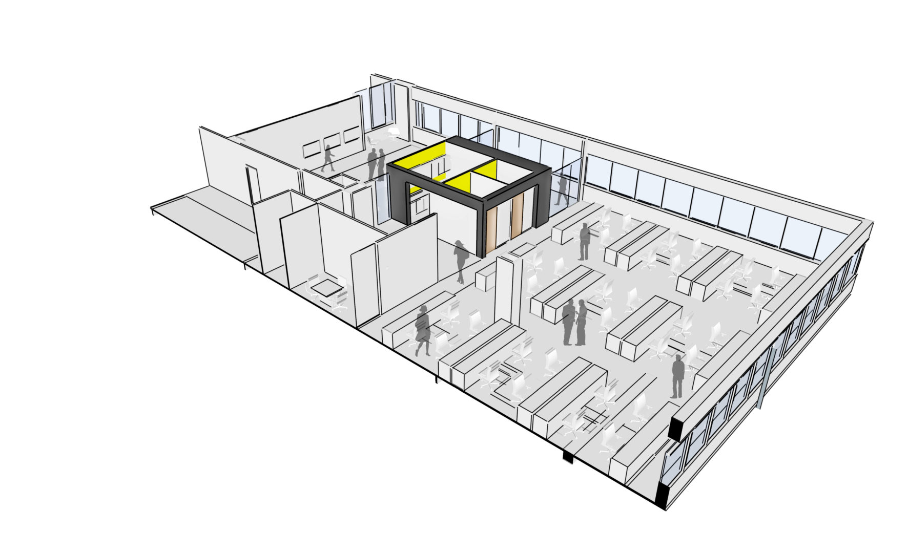
International Headquarters – Milford, CT
Materiality is important to activate the edges. As a design element, The Box can be perceived as “heavy,” floating, transparent, or opaque. The emphasis can be horizontal or vertical, if height is not a constraint. Color can help emphasize certain features, or be used for identity, such as with branding and wayfinding. We used color and soffit thickness to emphasize important zones and give it a continuous look from all vantage points. Brand colors were used in the kitchen, copy room, and phone rooms to accent specific walls and draw the user in. We also terminated The Box with glazing that gave the kitchen transparency, as requested by the client to designate zones divided by The Box.
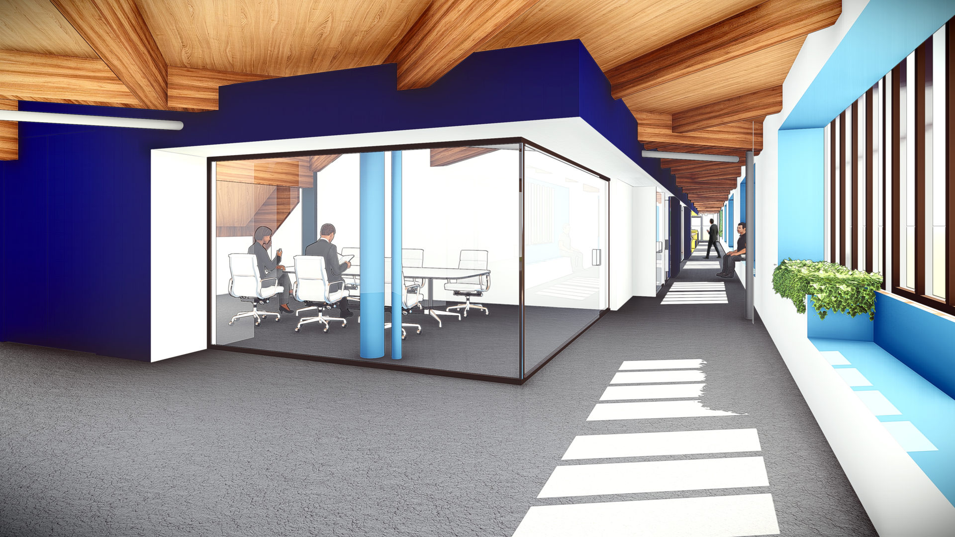
International Headquarters – Milford, CT
Existing conditions were a major influence in the development of our materiality and aesthetic to establish rhythms within the space. For our client, existing ceiling heights were a major restriction that dictated how we emphasized soffit heights and the edges of The Box. Overall, new elements need to exist within existing parameters to create an overall sense of belonging.
The Box is a highly versatile design solution with many applications in our emerging office environments.
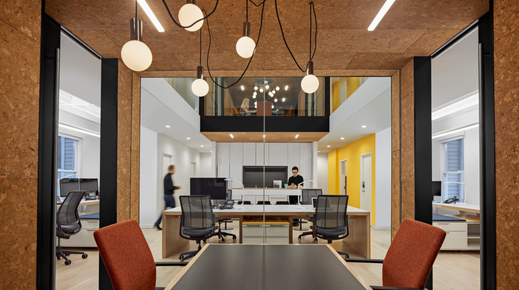
Quinnipiac University Brand Strategy Group – Hamden, Connecticut


