While a student at North Carolina State University, I had a class in a round building. The building was elevated, with multiple stairwells. The classrooms were in the center of the circle, with offices on the perimeter. You never knew quite where you were. If I was lucky to choose the correct stairwell upon exiting class in the round building, it would dump me at a bridge connecting to the next building and my next class. If I picked the wrong stair, I was likely to be late. It’s very disorienting to not know where you are.

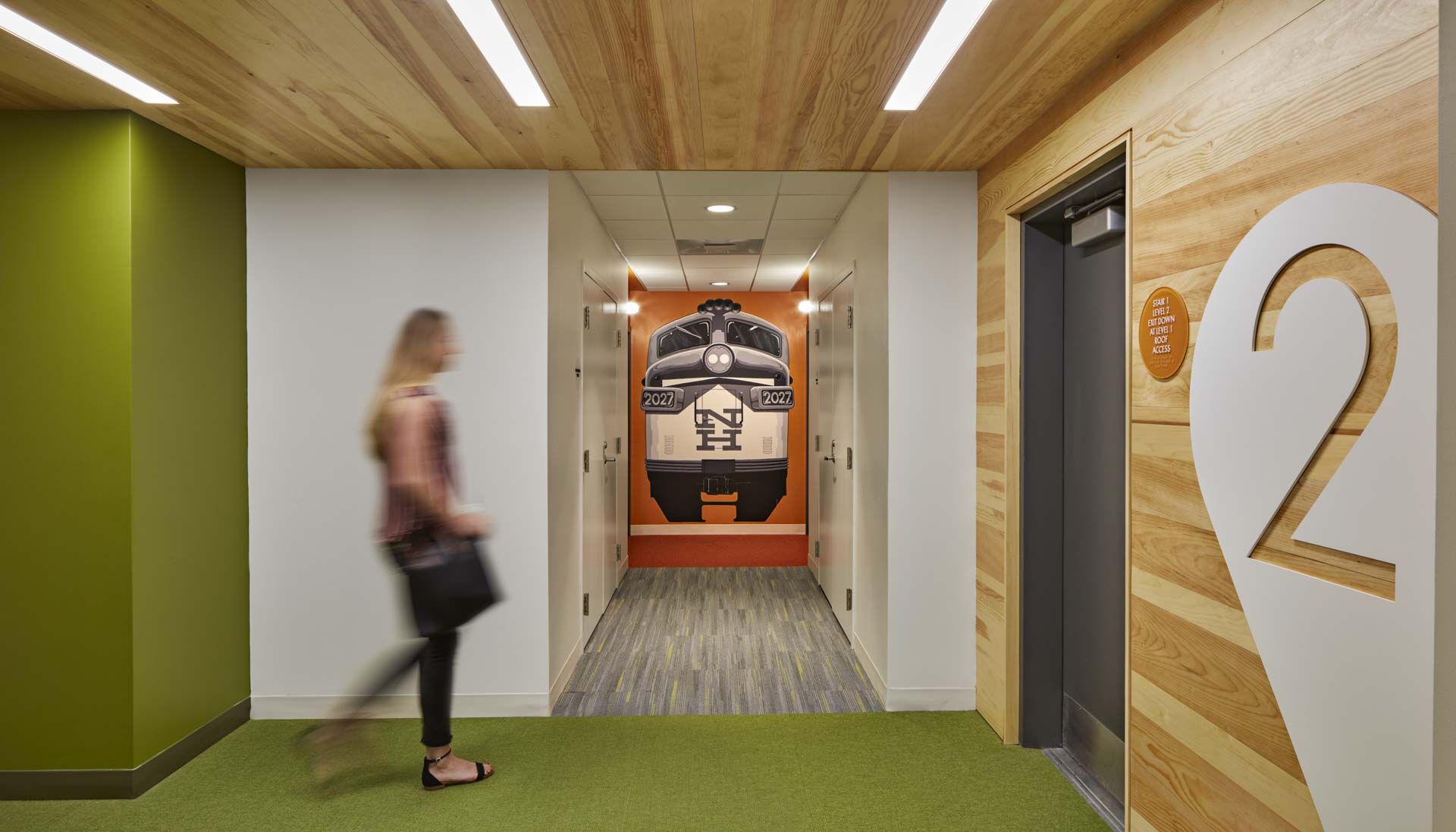
Strong, bold colors are used to differentiate floors at 616 New Park.
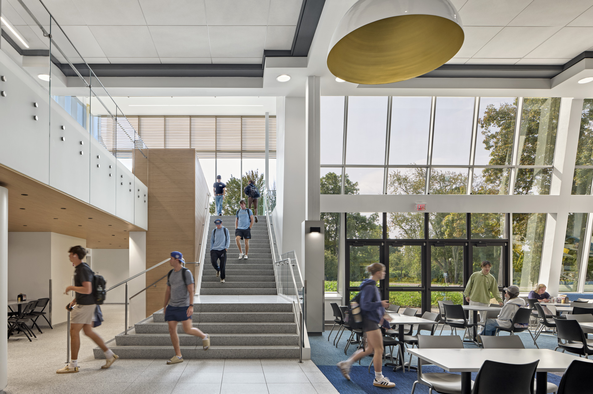
That memory has stayed with me as we work on complex corporate and institutional projects, even multi-family housing. Color is one wayfinding tool designers use to instruct and identify where someone is in a building, or where they need to go.

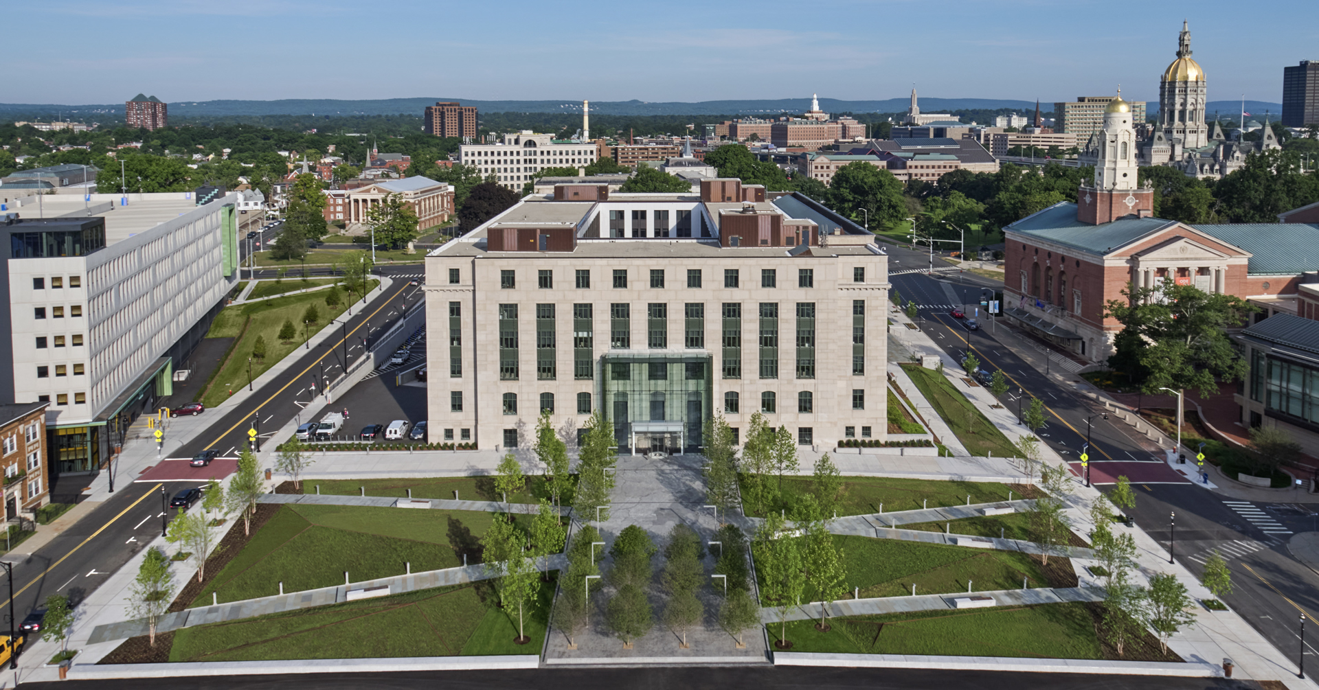
Rendering of a department in the State Office Building at 165 Capitol Avenue.
The use of strong, bold colors works well for visitors to a building who might be parking in a multi-level garage, for example. They remember they parked on the orange floor, or the red one. A similar strategy works for multi-family housing, mid-rise and high-rise.
Program elements identified by color, such as conference rooms, huddle rooms, or phone rooms, serve as both instruction and identification. “I will meet you by the yellow phone booth.” “Let’s use the blue conference room.”
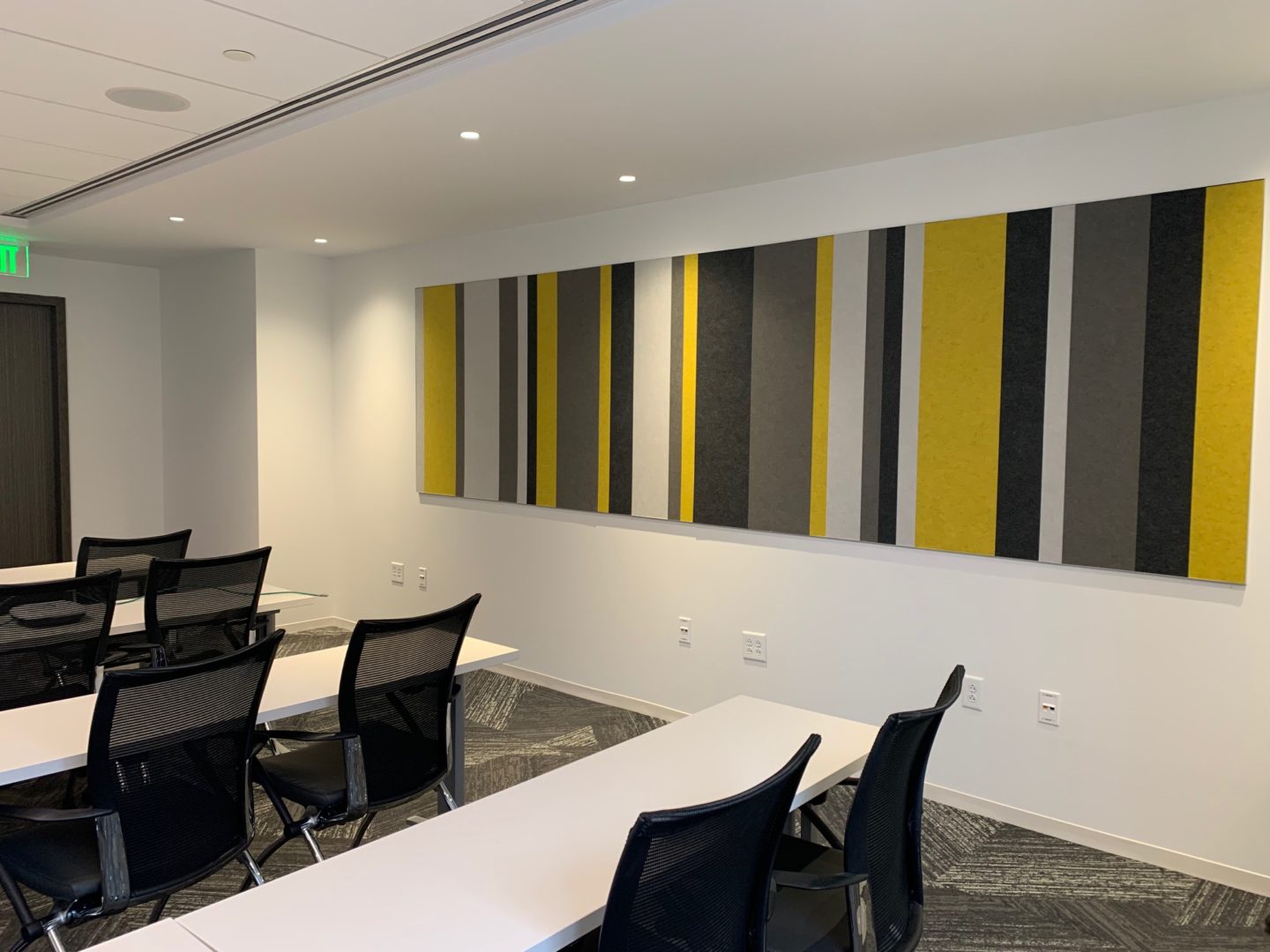
The yellow “quadrant” in the State Office Building at 165 Capitol Avenue.
Different strategies are needed for people who work in the same place. The newly renovated building at 165 Capitol Avenue in downtown Hartford is a great example. The State Office Building now accommodates Congressional Officers – legislators, the State Attorney General, Secretary of State, Comptroller, and Treasurer – and their staffs, approximately 750 people. Some departments span multiple floors in the seven-story structure, so color by floor didn’t make sense. The building itself is a large rectangle with an empty center – donut-like. Our strategy here was “color by quadrant.” Colors are muted – several neutrals with an accent color – denoting north, south, east west. Acoustic panels with the accent panel are used on the “short” sides of the floors. These everyday workers don’t need instruction, as much as they need identification. Signage reveals the floor level; color tells you where you are on the floor. The use of color then is reinforced with furnishings and carpet.
The important thing about using color as a wayfinding tool is to have a strategy, a concept. Color attracts. It must be intuitive.
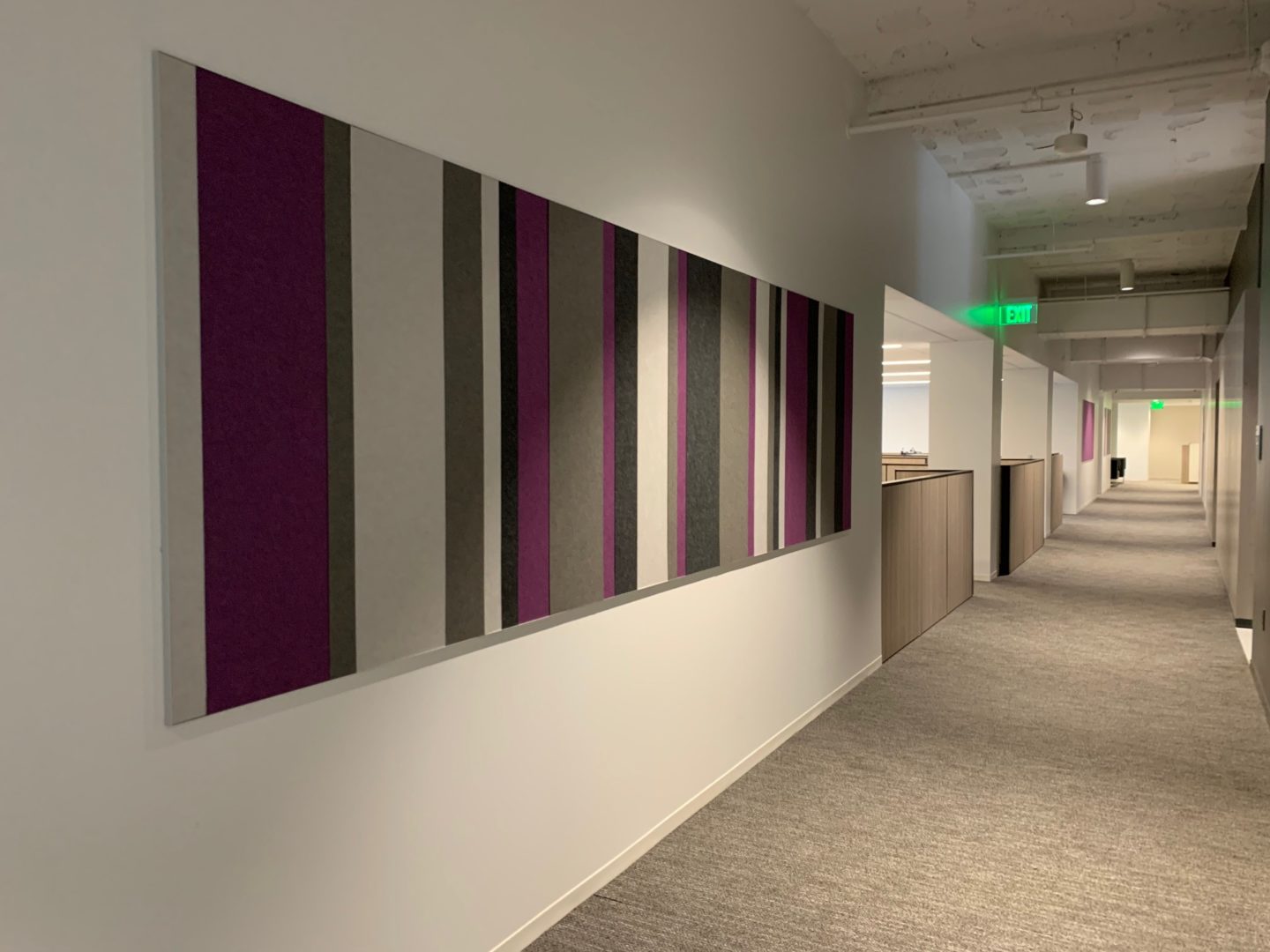
The red “quadrant” in the State Office Building at 165 Capitol Avenue.