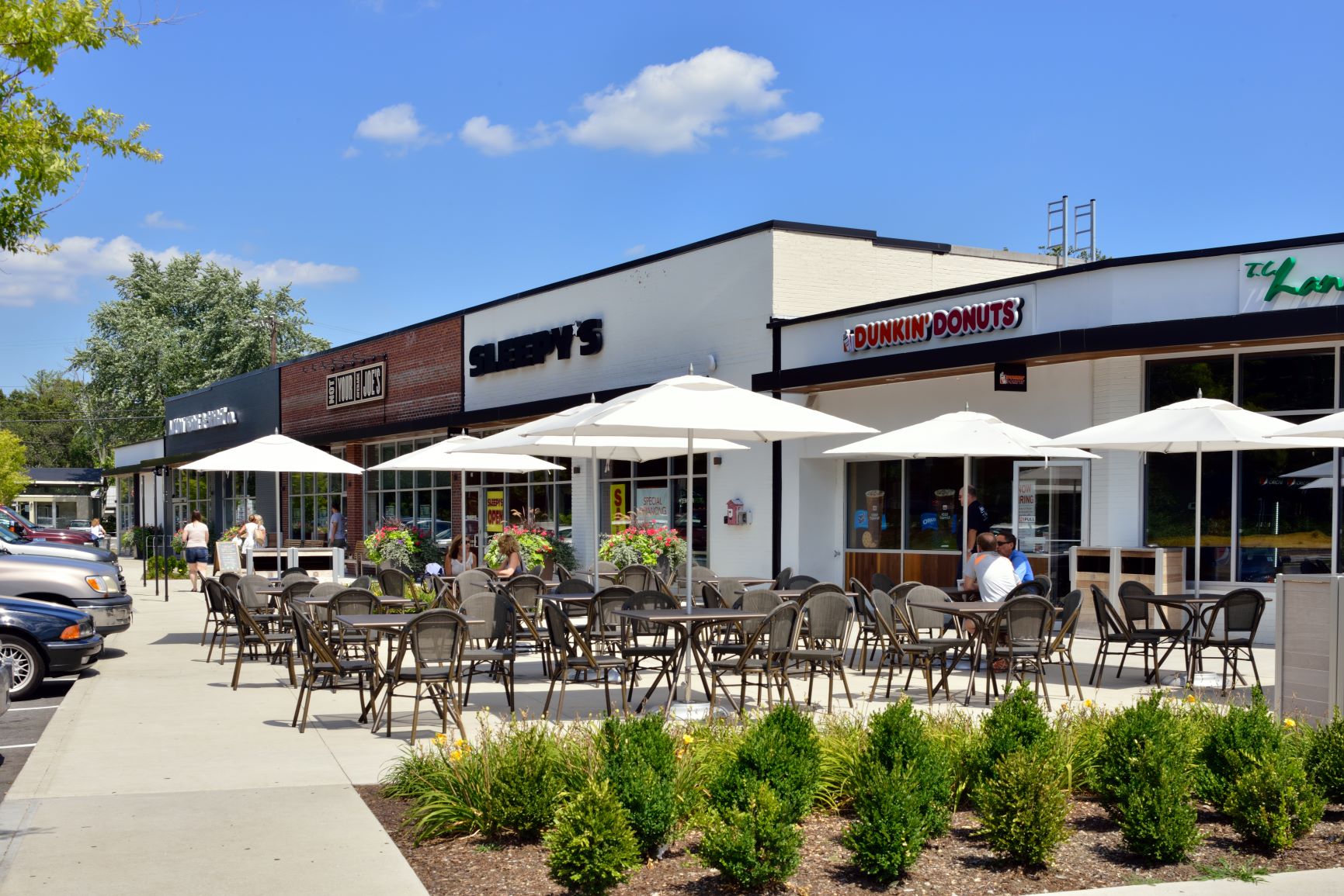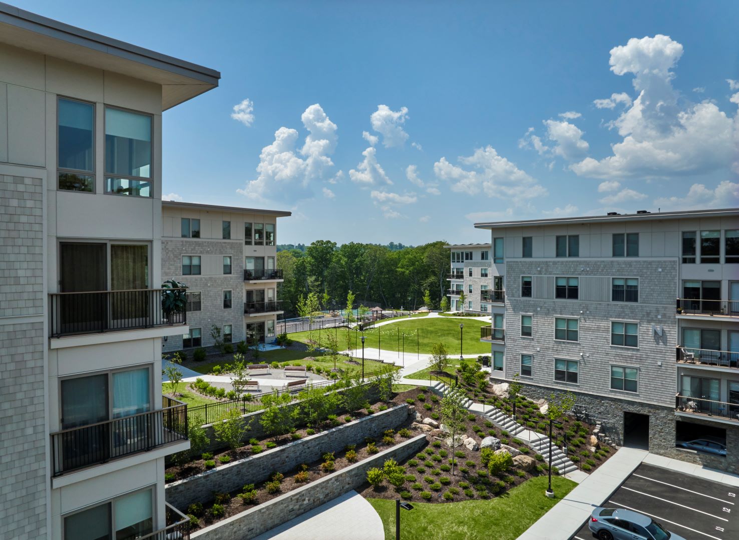
Acton Plaza – Acton, Massachusetts (photo credit: Jorge Salcedo)
(Excerpted from article published in the New England Real Estate Journal April 27-May 3.)
The paradigm shift that has occurred in retail, including the death knell for many major shopping malls, is not news. But how to create the next big successful thing is a challenge.
Developers who realize the value of the principles of New Urbanism are injecting energy into retail and mixed-use developments, assuring that people will have a vibrant experience and retailers will survive and thrive.
New Urbanism “is the revival of our lost art of place-making. It “promotes the creation and restoration of diverse, walkable, compact, vibrant, mixed-use communities.” Of special interest is Principle No. 5: Quality Architecture & Urban Design, which “places an emphasis on beauty, aesthetics, human comfort, and creating a sense of place. . . Human scale architecture and beautiful surroundings nurture the human spirit.”
Here are tenets we have applied to energize projects.
Hire the Architect Early
One common practice for new or redevelopment is to bring engineers onboard first. Solutions for cars, truck movements and utilities will be well-conceived, but the project will lack the desired customer experience. Architects bring a comprehensive point of view. They understand how to take the ingredients and mix them in ways to create excitement.
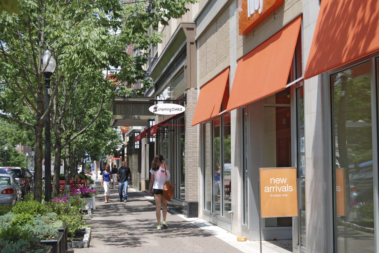
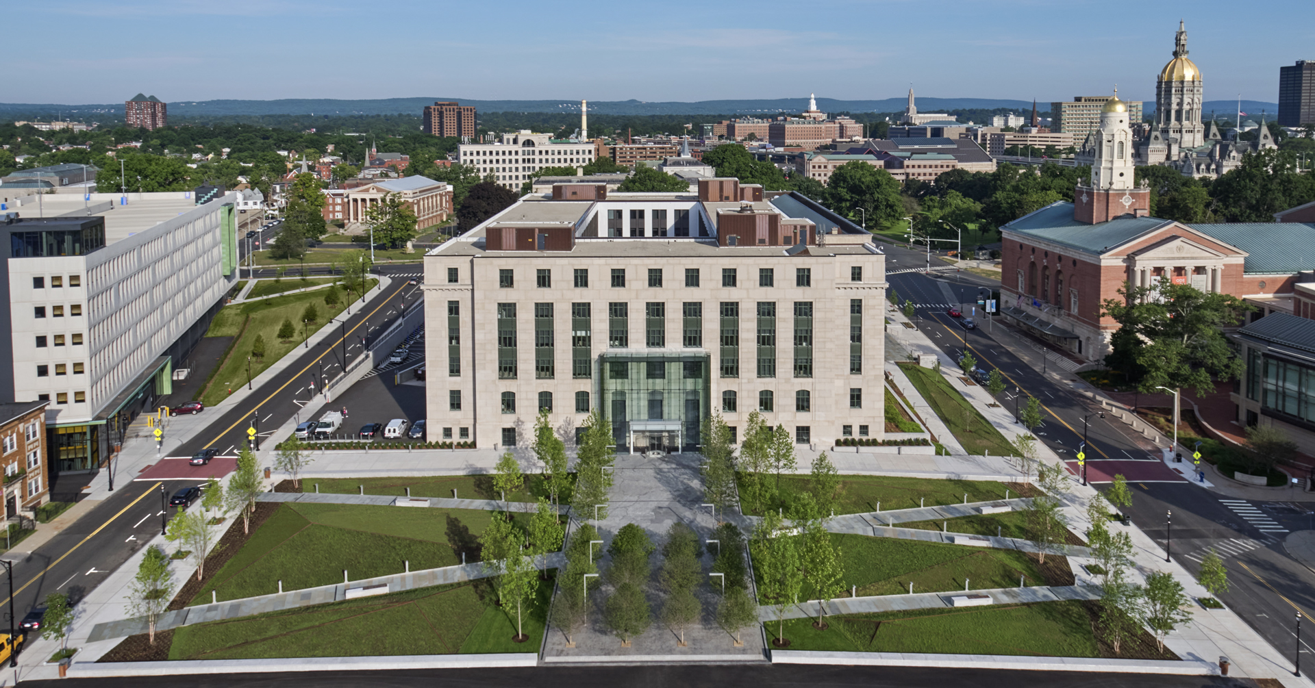
Blue Back Square – West Hartford, Connecticut
Understand the Ingredients of a Successful Community
The inherent density of urban centers makes them exciting places. Part of that has to do with feeling a sense of enclosure and protection. Suburban centers often lack that intimacy. Yet, urban lessons can apply. Consider a tree canopy to walk beneath; interesting shop windows, flower beds, nice signage that is oriented towards the pedestrian and a nice seating area or areas to take it all in. An evening stroll is successful if the lighting is soft but adequate and shop windows are illuminated nicely.
Create Design Guidelines
Create design guidelines and tenant handbook. Such guidelines allow considerable freedom to make storefronts purposely eclectic, yet they guide designs for façades, signage and landscaping. This achieves the appearance of a development that was built over a period of decades, as most town centers were.
Making Every View Count
As a culture still reliant on automobiles, there is always a question about where to put cars. Grocery stores, which help attract smaller tenants, are a great example. Parking proximity is important, as are places to stow carts. Landscaped islands on the perimeter of the property are an attractive way to contain the parking field.
Even more challenging is how to treat small retailers that populate the front of a development, so-called two-sided “out-parcel” buildings. These pad sites are highly profitable, but invariably retailers want the buildings close to and facing the street. That begs the question: what to do with the “back,” where you find service doors, gas and electric meters, even the dumpster?
Enhance the rear with interesting landscaping, “green walls” and wall graphics. If out parcels have a fast-food application, outdoor dining can be developed, but creating a green barrier and decorate fencing and lighting make this more inviting.
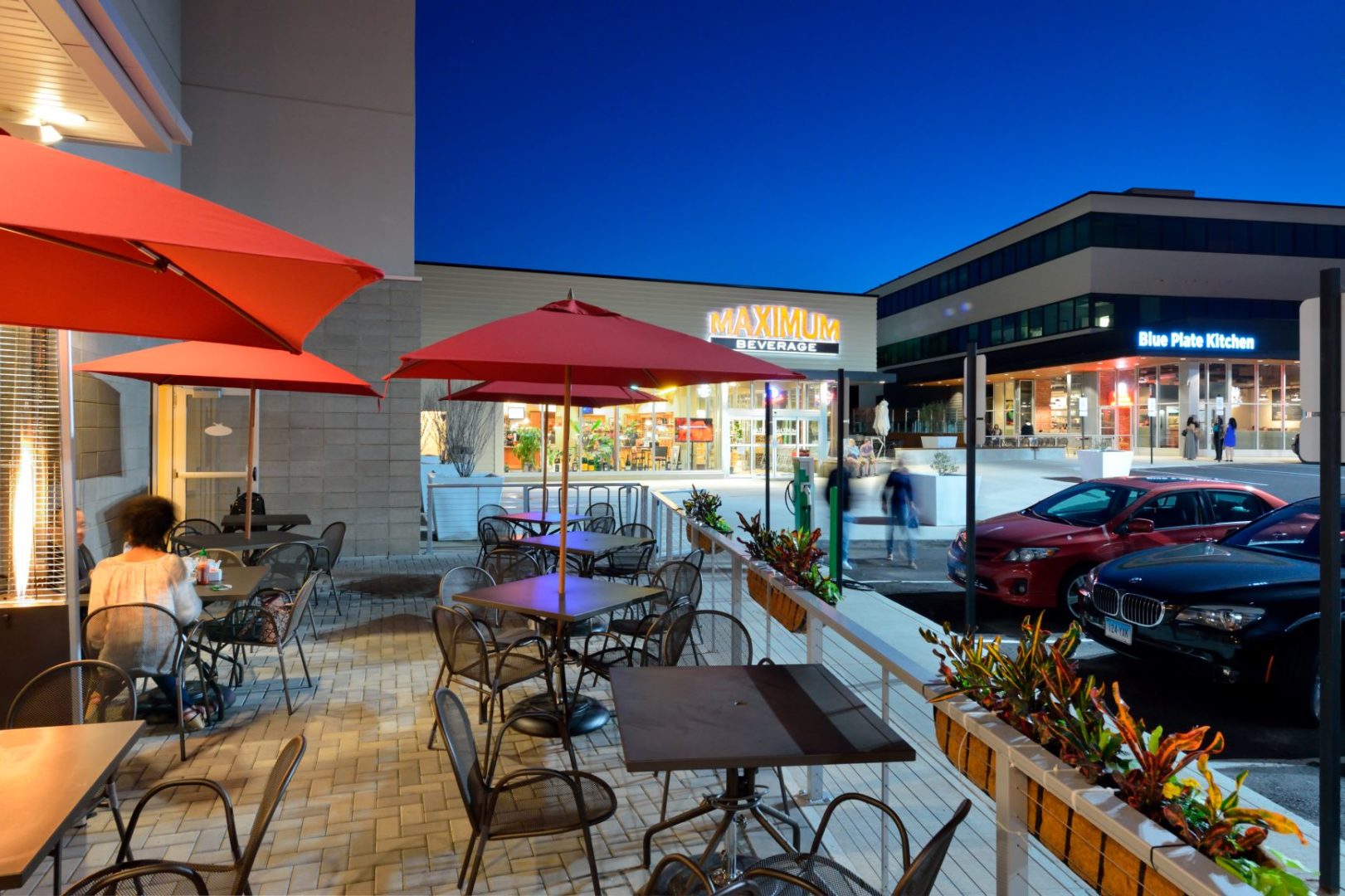
Bishops Corner – West Hartford, Connecticut (photo credit: Jorge Salcedo)

