We’ve all been in spaces that feel right, and we’ve all been in spaces where something feels off. For those not in the architectural/design profession, it may be difficult to articulate what it is about a space that affects us positively or negatively.
Our minds are constantly processing the space around us, looking for elements that define it. In design, we begin by understanding the spatial systems that are already in place. What is the column grid dimensions? What is the floor-to-floor height? Where are the views? What is the window mullion spacing? Understanding these systems influences the way we lay out a space. Once understood, everything falls into place: mechanical and sprinkler systems, lighting, and the architecture. These issues are especially important in corporate fit-outs, which typically involve renovating an existing space. Using the existing conditions as an underlay ensures that what we add to the space feels right.

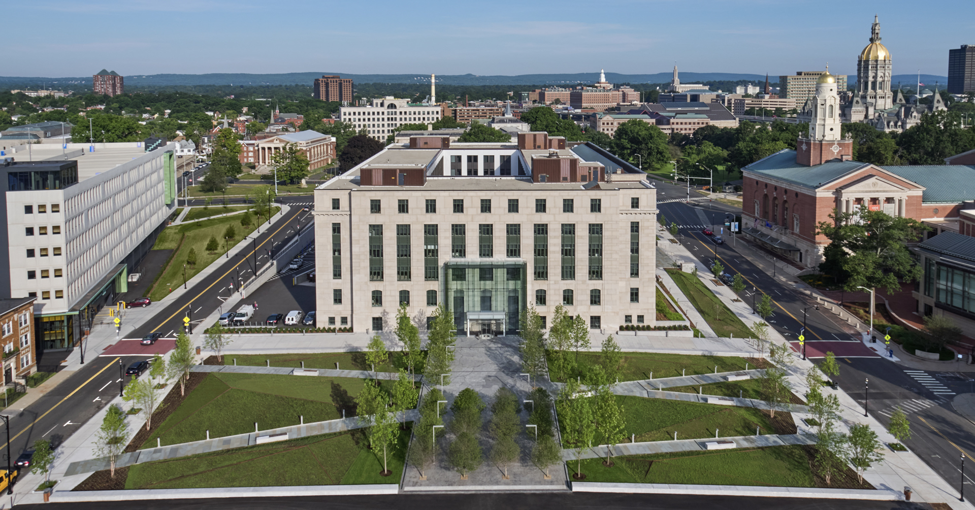
Connecticut State Office Building – 165 Capitol Avenue, Hartford, Connecticut
Size of program elements being at odds with the column grid spacing is a reoccurring challenge. An example is a civic project we are engaged with currently. The existing drawings showed a very tight column-to-column dimension. Our goal in areas designated for systems furniture was to use the column grid spacing to coordinate with the overall workstation layout. We were also exposing structure in these areas, which made it critical to understand how best to overlay these two systems. Our initial layout resulted in workstation spines not lining up along column grid lines and causing circulation paths not centered on windows. Everything fit, it just didn’t feel right. After studying the workstation design, we determined we didn’t need the side panels. Those few inches gained allowed the furniture system to work with the building system, while maintaining the required interior dimension of the workstation. Things lined up, center relationships were achieved, and other architectural systems fell into place.

Symmetry Partners – Glastonbury, Connecticut
Sometimes you don’t want the building system to dictate the architectural system you wish to apply. In this case, you need to know when it’s ok to break the rules. With Symmetry Partners, a growing financial services company in Connecticut, designers were challenged to bring daylight deep into the 40,000 square-foot building, formerly a windowless suburban bunker. This was partially achieved with a large, central skylight that grounded the main social/collaborative area. Designers exposed the steel structure. Program elements were enclosed in wood clad boxes positioned within the column grid layout. In this case, the boxes formed and shaped the space. The structure, painted a dark color, receded and became secondary. The result is two systems independent of each other but working together.
These spatial issues are subtle, but when they are not considered in advance, the result often is a confusing overall space concept.


